4 Tips for Designing a Standout Instagram Landing Page
In this blog, we will learn four essential tips for designing a mesmerizing Instagram landing page that will help you achieve your marketing goals.
Instagram is one of the most popular social media platforms in the world, boasting over 1 billion monthly active users. But how can you seize this massive audience to grow your brand? One creative solution is to create a standout Instagram landing page that converts visitors into leads and customers. Visitors access this page by clicking on profile bio links, affiliate links, ads, and more.
With a well-designed Instagram landing page, you can provide a delightful and engaging experience for your Instagram audience. At the same time, you can showcase the unique personality of your brand. You can even track marketing campaign effectiveness through conversion rate analysis.
Learn four essential tips for designing a mesmerizing Instagram landing page that will help you achieve your marketing goals.
1. Use high-quality images or videos
Images and videos can leave a lasting impression on your audience. It’s no wonder that 51.4% of marketers use visual elements in almost all of their content.

Visuals, after all, can help you get Instagram likes, gain more followers and increase shares.
But it’s not enough for you to use just any visual. You also have to make them appear sharp and engaging on your Instagram landing page.
Consider investing in professional photography or graphic design services to ensure top-notch quality. Ensure that your images meet the correct size and aspect ratio for optimal display on Instagram. For portrait photos, aim for 1080 by 1350 pixels (4:5 aspect ratio). For square photos, use 1080 by 1080 pixels (1:1 aspect ratio) .
Visuals shouldn’t just be used for aesthetic purposes on your custom landing page, though. Use them with a purpose, too.
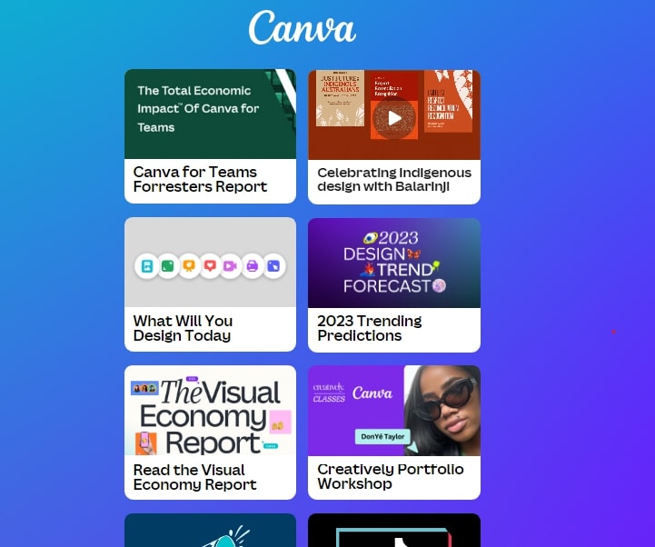
The right visual, be it an image or video content, should also help your followers understand where each of the clickable links on the landing page leads to. Let’s take a look at an example.

With the help of pictures, Canva has designed an appealing regular landing page that aligns with their goal of helping users create excellent graphics. The visuals not only add aesthetic value but also serve a practical purpose. They help visitors understand what they’ll see when they click on the promotional links.
As you know, Instagram is a social network that thrives on visuals. A whopping 69.8% of users don’t just go to Instagram to schedule Reels, post Stories and publish other types of content. They’re there to share existing content with their friends and family as well. If your visual content doesn’t meet their standards, you won’t be able to take advantage of that free promotion.
2. Keep copy concise and compelling
A concise yet compelling message can help you communicate your unique selling proposition (USP) on Instagram. According to a study sponsored by Microsoft, the average human attention span is just 8 seconds. This means you only have that much to capture and keep your visitor’s interest before they bounce off your page.
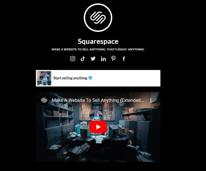
To achieve this, use concise, attention-grabbing headlines that highlight the benefits of your offer. Take a cue from Squarespace’s landing page.

Through their carefully crafted headline, they outline what prospective website designers can expect from their service–you can “make a website to sell anything.” This approach eliminates any form of double-talk surrounding their offering. The “sell anything” part also catches any visitors’ eye.
You should also employ second-person language when writing your copy. This copywriting technique sees you addressing the readers directly, making your text more engaging.
3. Have a clear CTA
The purpose of the call-to-action button is to guide visitors toward taking your desired action. That action may be them making a purchase, booking an appointment, or giving their email address. Without calls to action, your visitors may move on from your Instagram landing page without further engagement.
But including the first call-to-action you think of won’t cut it. There are steps to consider when creating an effective CTA for your Instagram landing page.
To begin, prioritize specificity and action-oriented language. Your CTA should clearly communicate what you want visitors to do and set expectations for your visitors. So, if you want them to sign up for your email list, a good CTA could be “Sign Up,” for example. Or, if you want them to buy your merchandise, a good CTA could be as simple as “Buy.”
In addition, make your CTA stand out on your Instagram landing page. You can do this by employing contrasting colors and a huge font.
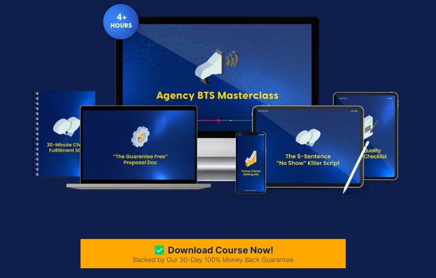
Here’s a landing page that has a CTA that stands out thanks to its color that contrasts against the blue background:

Experiment with different click triggers, color combinations, button styles, or placements through A/B testing. It’s all about finding the most effective design that gets those click-through rates soaring.
Don’t worry if you don’t have marketing and design skills just yet. You can use a landing page template built by specialists to provide a solid foundation for your project.
4. Optimize for mobile viewing
In today’s digital landscape, optimizing your Instagram landing page for mobile viewing is a must. After all, of the 4.48 billion social media users, 99% access these platforms through mobile devices. Those mobile users include Instagram users, of course. Also, the average person spends 3 hours and 15 minutes on their phone each day — and 1 in 5 smartphone users spends upwards of 4.5 hours on average on their phones every day.
That’s not all. Studies reveal that positive mobile interactions powerfully shape consumer behavior. Around 89% of consumers are likely to recommend a brand after having a satisfactory experience on their mobile devices. On the flip side, if they face unfavorable mobile website experiences, they tend to dissuade others from patronizing the business.
In other words, not optimizing your Instagram dedicated landing page can have dire consequences for your brand.
So, adopt a mobile-friendly design approach. Some tools like Instapage offer responsive Instagram landing pages you can use. The landing page elements adapt depending on the screen size.
Check out the example below.

Having a responsive design also means keeping things simple in terms of layout and content presentation. Your design will only look cluttered if you have too many elements to be shown on a smaller screen.
Before you launch your custom landing page, take the time to test it on various mobile devices and browsers. Check for any display issues, misalignments, or broken elements that could hinder usability or detract from the overall user experience.
When designing social media landing pages, optimize the loading speed on mobile as well. Aim for a brisk three to five-second load time. Before you deploy your landing page, ask someone else to see how long it takes for it to load. If it’s more than five seconds, you might want to reduce your Instagram landing page content or check if your images have been optimized.
In closing
A well-designed Instagram landing page can greatly enhance your marketing efforts. You learned how to design a standout Instagram landing page with this article.
Just remember to use high-quality images or videos, keep your content concise and compelling, and use a clear CTA. Make sure you optimize for mobile, too.
If you follow this step-by-step guide, you’ll be able to create a landing page that leaves a lasting impression on your visitors. It can attract, engage, and convert your target audience.
Happy designing!
Author Bio:

Harry Flynn leads the digital marketing team at Twicsy, a site providing services to Instagram users. He enjoys traveling and relaxing with friends in his spare time.