Instagram color palette: Ultimate guide to making your profile an eye candy
Written by: Hrishikesh Pardeshi, Founder at Flexiple, buildd & Remote Tools.
Last updated: Sep 03, 2024
Instagram color palette can help you with more engagement from the target audience, the most effective way to please new followers while on your Instagram feed?
TL;DR & Summary
The use of color palettes can help to enhance the visual appeal of any Instagram profile and create visual harmony and aesthetics on your Instagram page. This is useful for businesses (ex. fashion blogs), brands (ex. SaaS), and influencers (ex. YouTubers) who use Instagram to promote their business.
Using a specific color theme, they can make their content stand out and easily recognizable by their audience. Furthermore, color themes can help create symmetry on your Instagram profile. This makes your profile more visually appealing and those who visit your profile, especially those visiting for the first time, are more likely to follow you.
Carefully choose colors for your profile, but keep in mind that it's just a small part of your overall brand. Don't overthink and waste too much of your time on these aesthetics. These cosmetics will work only if your content is appealing and helpful for your existing audience, let alone the new ones.
Table of Contents
What is an Instagram color palette?
An Instagram color palette is a selection of a set of colors that represents the brand you're creating. This is why color palettes are also referred to as brand colors. These are useful especially for Instagram users who visit your profile for the first time and you want them to follow your Instagram profile.
These colors can be used in so many different ways, such as the background, font color, and a neutral color for borders. The use of the color palette can help create a polished, professional, and visually appealing experience for users when they're on your Instagram profile. This can be beneficial for businesses, especially emerging ones.
Related: Explore top 10 stalker apps for Instagram
Do's and don'ts of Instagram color palettes
Deciding your own color palette for your Instagram account can be intimidating, especially if designing isn't your core strength. It can be overwhelming in so many ways. Let's make it easier for you by talking about what you should and shouldn't do when picking up your brand color.
Here are some "do's" and "don'ts" of using color palettes on Instagram:
Do's:
-
Use a limited color palette: Using a limited number of colors can help to create a cohesive and consistent aesthetic. Don't use too punchy and too many colors, 3-4 colors should be fine so that you can create a good color combination.
-
Use colors that reflect your brand or personality: Choose colors that are appropriate for your brand or that reflect your style. Drill down the rabbit hole of color psychology to understand how colors make people feel.
-
Use neutral colors: Neutral colors can help to create a balanced and polished look and can be used as a background or borders. These colors add balance to the overall design of the post you're creating.
-
Experiment with different color combinations: Try different color combinations to see what works best for your profile. Show it to your friends and family and consider their honest feedback. You might get blindsided, but they won't. You can consider using the same color palettes on your website as well.
Don'ts:
-
Use too many colors: Using too many colors can make your profile look cluttered and chaotic. Each color represents an emotion, colors have a certain frequency and trigger relevant emotions with it. Using too many colors will confuse your audience.
-
Use colors that clash: Avoid using colors that clash or that don't work well together. Not using neutral colors can make your profile look unbalanced.
-
Forget to consider the psychology of your audience: People react differently towards different shades of colors. If you're a food blogger, using red and yellow (McDonald's) for the color palette will prove to be useful.
Related: Instagram Marketing 101: Ultimate guide to growing your Instagram for business
How to create your color palettes?
The best way to create color palettes for your Instagram profile is to research. Look at the profiles you admire, especially with such symmetry. Take inspiration from those profiles, even if you copy the same color palette, nobody is going to claim copyright against you.
However, you will fail to convey the same message they're conveying with the colors you copied. A color palette has one main color that's visible front and center. It becomes the identity of your brand. Keep in mind how your audience will perceive your content because of that color, the readability & the dominance of that color, etc.
Also, pick a neutral color that adds contrast to the primary color. These two colors should complement each other and eat each other up. Since the neutral color will be used very subtly, pick a color that's prominent and visible even if it's used very little.
You may need to experiment a lot to have visual harmony to create the color palettes. Check out other businesses that do similar things with their Instagram profile, and ask their opinion about your color palette.
Related: How to create a fake Instagram account? [Do you even need it in the first place?]
Types of color palettes you can try
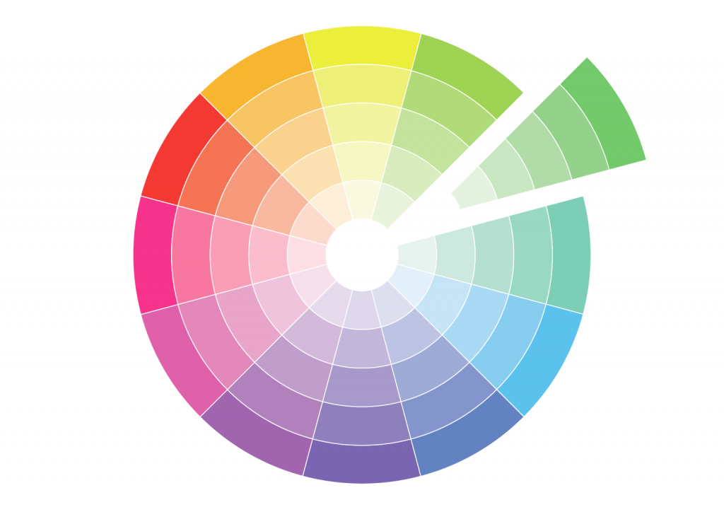
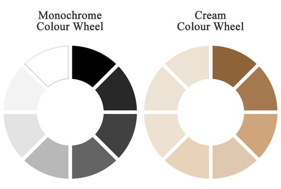
#1 Monochromatic: This type of color palette uses different shades & tints of dominant colors.
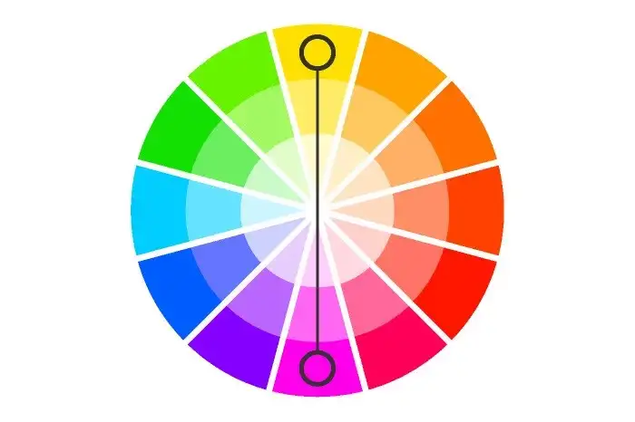
#2 Complementary: This type of color palette includes colors that are opposite to each other on the color wheel. This creates a high contrast and dynamic color palette.
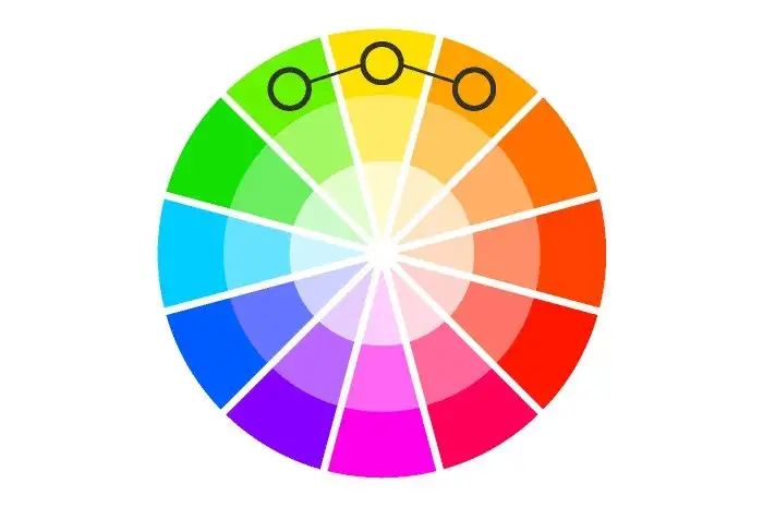
#3 Analogous: This type of color palette uses colors that are next to each other on the color wheel. If you pick analogous colors for your color palette, you will get a neutral look for all your photos.
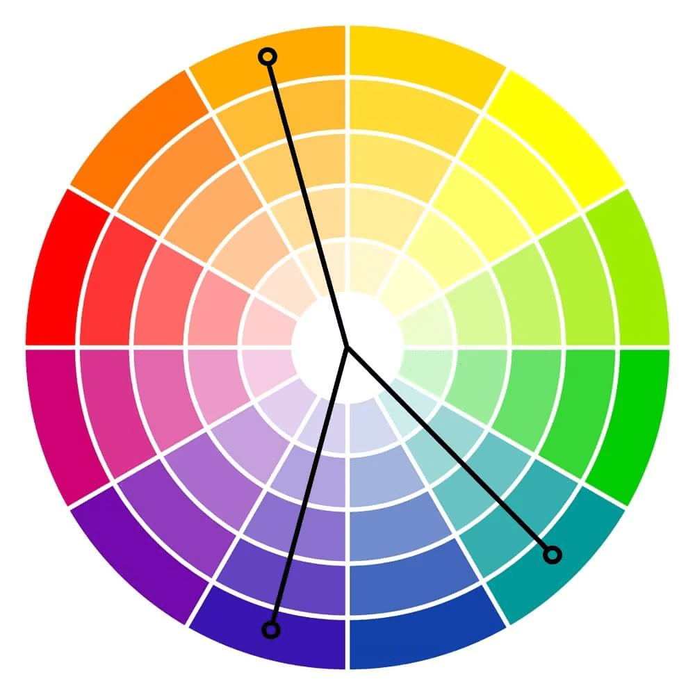
#4 Triad: Triad color palettes include colors that are evenly spaced on the color wheel. This will create a balance of dynamic & vibrant depending on the shades of color you choose.
#5 Neutral Plus: A neutral plus color palette is made out of a shade of neutral colors for example black, white, and grey with a pop of one or two neutral colors. This mix creates a clean and polished look and can be a good option if you want to create a professional-looking color palette.
Apps for color palettes [Color palettes generator]
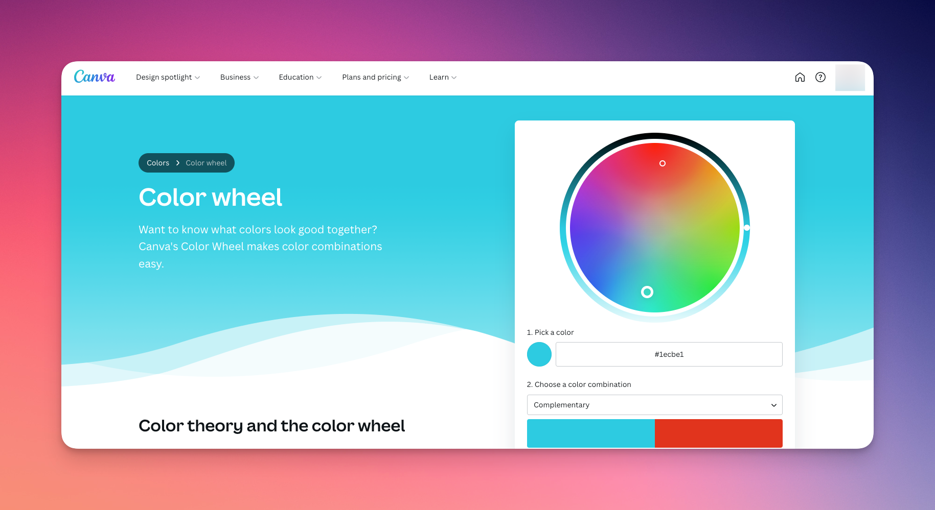
#1 Canva's color wheel tool
Canva's color wheel tool is a free online resource that allows you to create and explore different color palettes. It provides a user-friendly interface that allows you to experiment with different color combinations and create a custom Instagram palette.
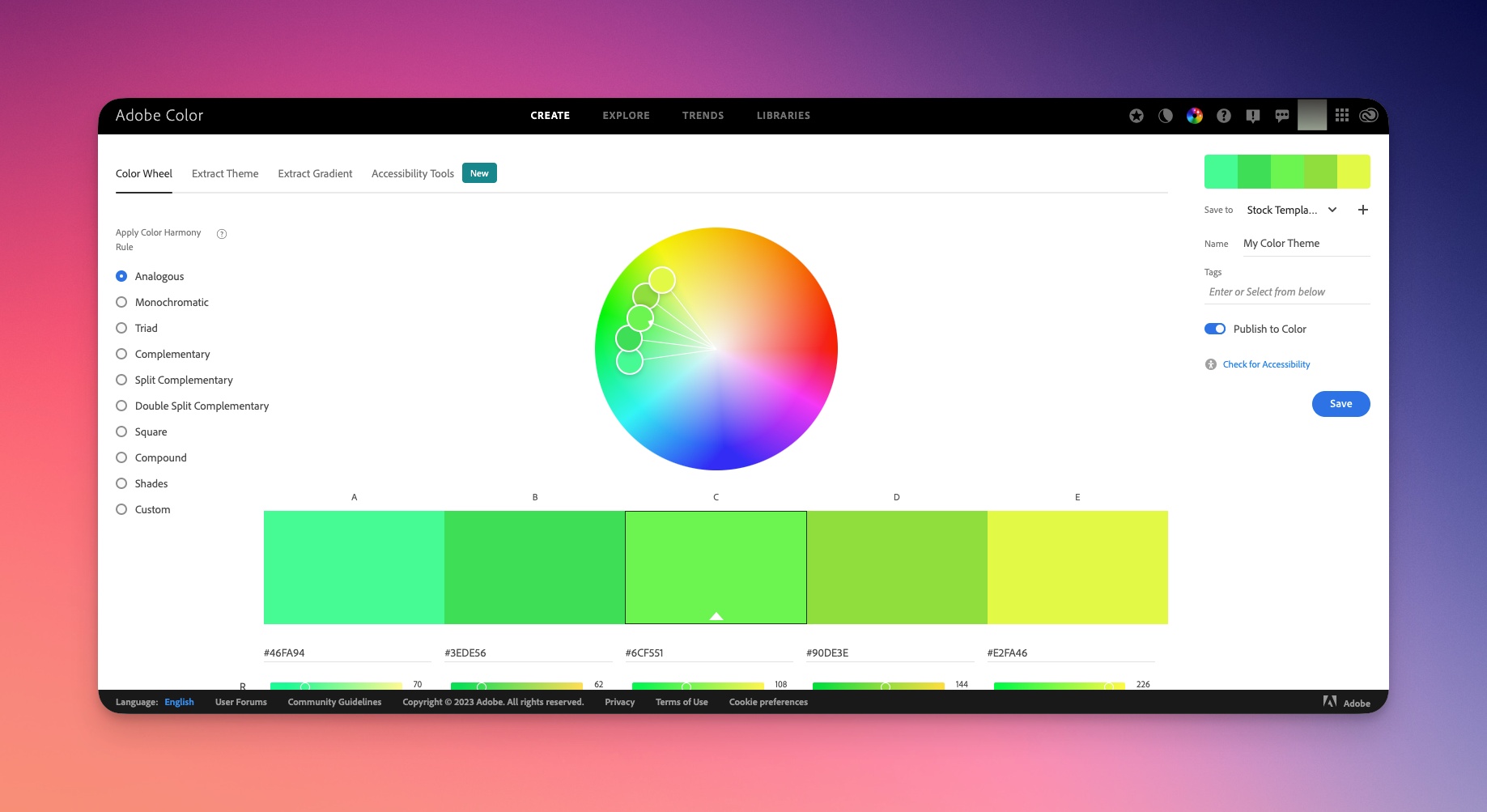
#2 Adobe's Color wheel
Adobe Color's color wheel is a powerful online tool that allows you to create, explore and save color palettes. It provides an advanced color wheel, color schemes, and color harmony tool, which can be very helpful for designers and developers.
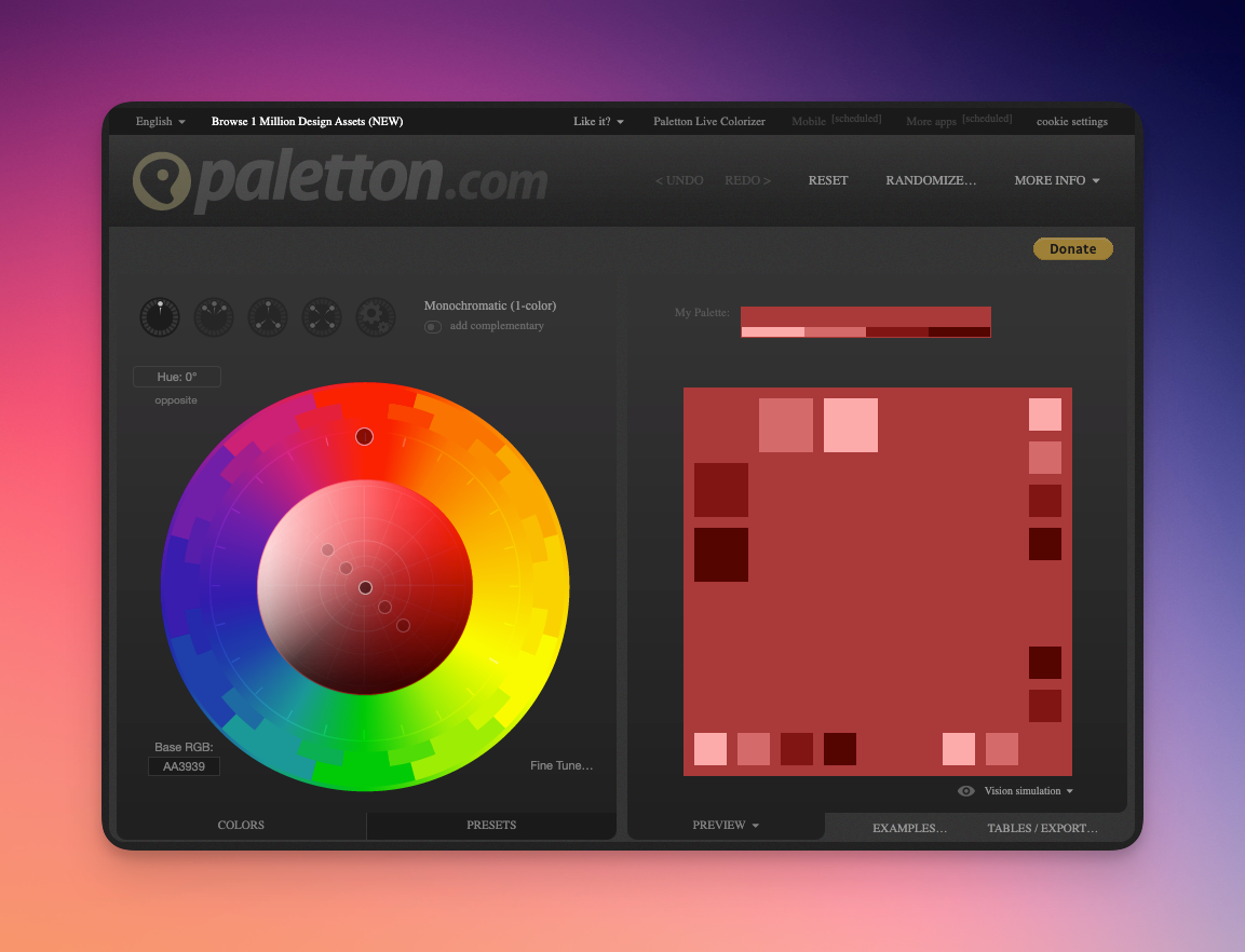
#3 Paletton
Paletton is a free online color scheme generator that allows you to create, explore and save color palettes. It provides a user-friendly interface that allows you to experiment with different color combinations and harmonies, and it also has options for monochromatic, analogous, complementary, and triadic color schemes.
Frequently Asked Questions
What colors do best on Instagram?
It is difficult to say which colors perform the best on Instagram as they can vary depending on the context and audience. However, studies have shown that certain colors are more attention-grabbing, such as red, orange, green, teal, and pink. It's also important to choose colors that align with your brand and aesthetic.
How do you get a consistent look on Instagram?
To get a consistent look on Instagram, it's important to use a consistent color palette, consistent image and video styles, consistent captions and hashtags, and a consistent posting schedule.
Is ColorKuler free?
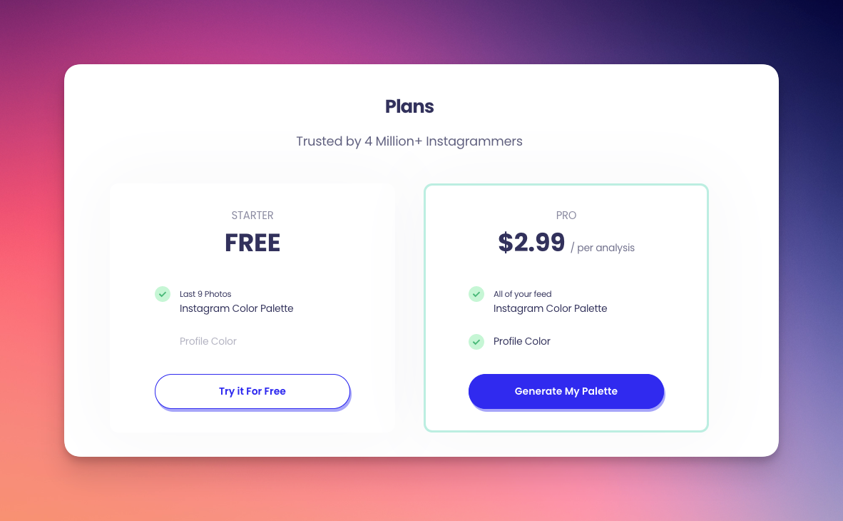
ColorKuler is a free web application that allows you to extract the color palette of your images and videos. The free plan will analyze the first 9 images you posted on Instagram. There's a paid version as well that analyzes the full Instagram profile to suggest a color palette matching your profile.
How do I find pictures that match my color palette?
You can use a reverse image search tool such as Google Images or TinEye, to search for similar images based on the colors in your palette.
Which Colour is most attractive for an Instagram post?
It is difficult to say which color is the most attractive for an Instagram post as it can vary depending on the context and audience. However, studies have shown that certain colors are more attention-grabbing, such as red, orange, purple, and pink.
What is the best Colour for branding?
The best color for branding can vary depending on the company and industry. It's important to choose colors that align with your brand message and aesthetic.
What are the 4 types of color schemes?
The four main types of color schemes are monochromatic, complementary, analogous, and triad.
What are the 7 colors schemes?
The seven color schemes are monochromatic, complementary, analogous, triad, tetrad, neutral plus, and accented neutral.
How do you change the color theme on Instagram?
Currently, Instagram does not have the option to change the overall color theme of the app.
Which Colour is best for Instagram?
It is difficult to say which color is the best for Instagram as it can vary depending on the context and audience. However, studies have shown that certain colors tend to be more attention-grabbing, such as red, orange, and pink. It's also important to choose colors that align with your brand and aesthetic.
How does ColorKuler work?
ColorKuler is a free web application that allows you to extract the color palette from an image or video by uploading the file or providing a link. It then generates a color palette of the main colors used in the image or video.
How do I find out what color my Instagram is?
You can use any color palettes tool, such as Adobe Color, color palette generator by Canva, and Palette Generator, to create a custom Instagram color palette.